
Introduction
Governance without measurement is guesswork. Most transformation programs either measure nothing until something fails, or measure everything and drown in dashboards that nobody reads. The Value Assurance Dashboard sits between those two failure modes: a single page that tells a sponsor, in under two minutes, whether the transformation is tracking and where attention is needed.
It is the Guide phase's integration artifact. It turns the target state defined in Design into observable signals, and it turns the guardrails defined elsewhere in Guide into thresholds that can be checked. When a cell on the dashboard goes amber or red, it points at a specific lens, a specific workflow, or a specific maturity dimension, so the conversation is about something concrete rather than a general sense that things are slipping.
The dashboard is not a metrics library. It holds only the signals that would actually change a decision. Everything else lives in the operational systems that produced it.
Phase | Guide |
Lens | Integration |
Purpose | Track whether the transformation is delivering the target state across the three lenses and the selected workflows, weekly and by cycle |
Output | Completed Value Assurance Dashboard, with baselines set, targets agreed, review cadence running |
Who's Involved | Transformation lead, PMO, lens owners, workflow owners, sponsor |
Duration | Initial setup: one day. Ongoing: weekly or monthly review, 30 minutes |
When to use it
Set the dashboard up in Guide, once the Target Operating Model Canvas is signed off and the guardrail exercises are drafted. The dashboard translates target state and guardrails into something measurable.
Run the dashboard continuously through Evolve. It is a live instrument, not a one-time artifact. Review cadence is typically weekly for the first two cycles of rollout, monthly thereafter, with ad-hoc reviews when a cell flips red.
Inputs and outputs
Inputs (upstream exercises the dashboard draws from):
Target Operating Model Canvas (defines what "working" looks like)
Transformation Vision Canvas (success signals become dashboard metrics)
Current State Canvas (baselines for each metric)
Workflow Transformation Portfolio (which workflows get their own row in Workflow Health)
Guide phase guardrail exercises (each guardrail has a measurable compliance signal)
Pilot Design Canvas outputs (pilot results feed the relevant cells)
Outputs (what the dashboard feeds):
Lessons Learned Log in Evolve (anomalies on the dashboard trigger learning)
Transition Playbook in Evolve (dashboard readings drive sequencing decisions)
Sponsor reporting (the dashboard is typically the sponsor's primary program view)
Steps
Confirm the target state. Open the Target Operating Model Canvas and the Transformation Vision Canvas. Every metric on the dashboard must trace back to a success signal one of those two artifacts names. If it does not, either the metric does not belong here or the upstream artifact is incomplete.
Set lens metrics. For each of Architecture, Operations, and Experience, select three to five metrics that would actually change a decision. Avoid vanity metrics; favor leading signals over lagging ones where possible. Name the data source for each.
Set baselines. Pull current values from the Current State Canvas and the AI Initiative Inventory. If a baseline does not exist, either establish one now or mark the metric "baseline pending" and commit to a date.
Set targets. Each metric gets a target aligned to the Transformation Vision Canvas success signals. Agree thresholds for green, amber, and red.
Populate Workflow Health. Add one row per workflow in the Transformation Portfolio. Define per-lens signals and the overall rollup rule (typically: red if any lens is red, amber if any is amber, otherwise green).
Populate Maturity Progress. For each lens, record the baseline, current, and target maturity. This row is updated per cycle, not per week.
Define the review cadence. Name the review owner, the meeting rhythm, the attendees, the standing agenda, and the escalation triggers (what turns a red cell into a conversation with the sponsor).
Connect feedback loops. Name the mechanism by which dashboard anomalies feed the Lessons Learned Log in Evolve and, where appropriate, adjust the Transition Playbook.
Run the first review. Walk through the dashboard end to end with the sponsor and lens owners. Sign off on baselines, targets, and review cadence. This becomes the operational instrument from here on.
Keep it maintained. A stale dashboard is worse than none. Assign an owner responsible for weekly updates, and revisit metric selection quarterly to drop metrics that have stopped changing decisions.
Common pitfalls
Measuring what is easy to measure. Usage, logins, and task counts are cheap to capture and rarely tell you whether the transformation is working. Invest in the harder signals: trust, quality, adoption depth, downstream outcomes.
Dashboard sprawl. Sixty metrics nobody reads is worse than twelve that are reviewed weekly. If a metric has not triggered a conversation in three cycles, take it off.
No escalation triggers. A dashboard without agreed triggers is a report, not an instrument. Name what turns a red cell into action.
Disconnecting the dashboard from the target state. Every metric should trace back to a Transformation Vision Canvas success signal or a Target Operating Model Canvas commitment. Metrics that cannot be traced should be questioned.
Skipping the experience lens because it is qualitative. Experience metrics are harder to quantify but not less valid. Self-reported trust scores, adoption interviews, and friction logs all count.
Treating the dashboard as sponsor theater. The most useful dashboard is the one the transformation team uses to run the program; the sponsor view is derived from that, not the other way around.
Template
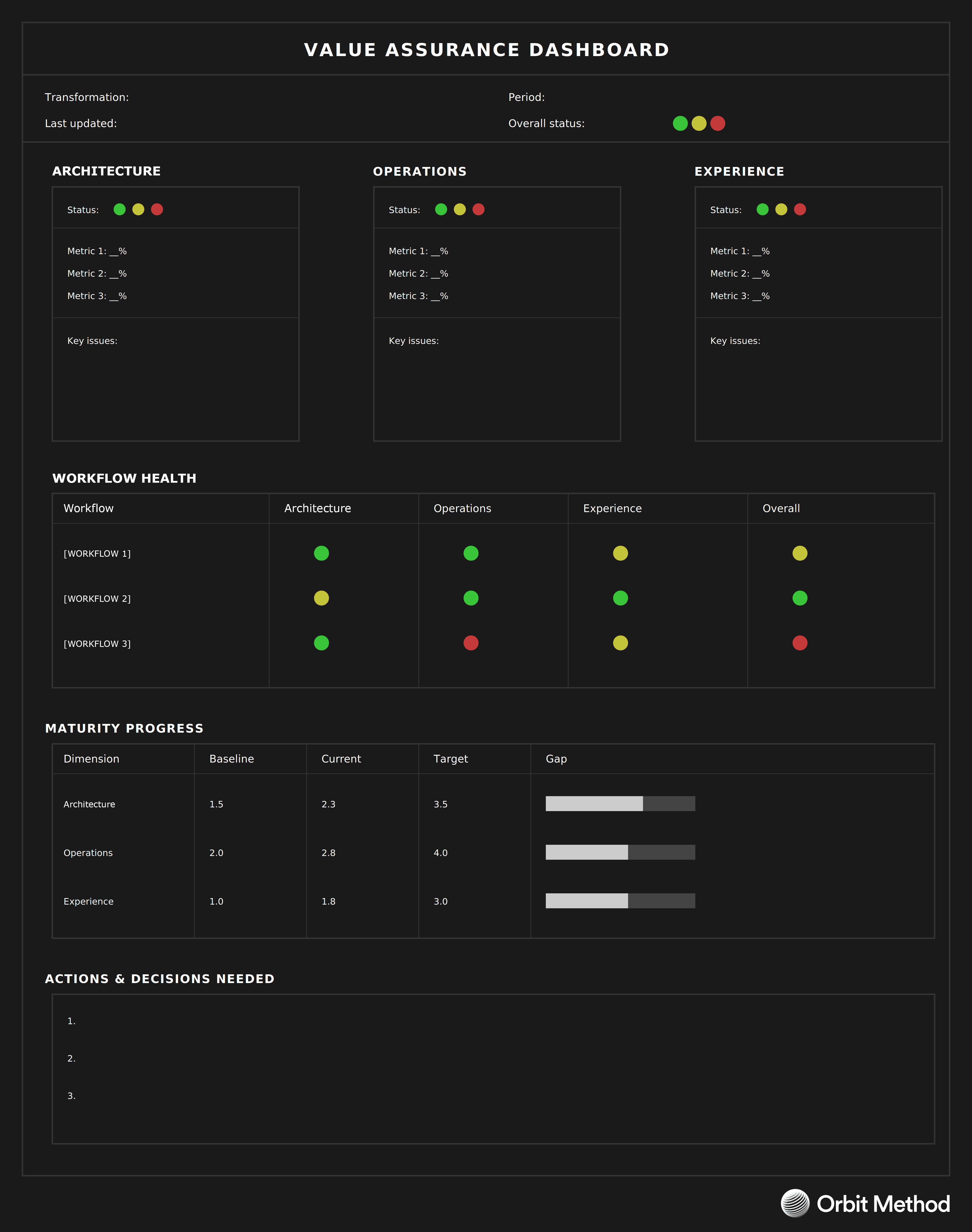
What the dashboard shows
The dashboard opens with a header strip that names the transformation, the review period, and the overall status at a glance. The rest of the page is organized into four blocks.
Lens status is three parallel blocks, one per lens (Architecture, Operations, Experience), each with its own status signal, three to five leading metrics, and a short key-issues field. This is where the "why is it amber" question gets answered.
Workflow Health tracks each workflow selected in the Transformation Portfolio, with a status signal per lens and an overall rollup. A red cell here points to a specific workflow in a specific lens, which is the resolution the transformation team needs to act.
Maturity Progress shows the baseline-to-current-to-target arc for each lens, with a visual gap indicator. This is the longer-horizon view: even when the weekly lens status is green, maturity progress tells you whether the transformation is actually moving.
Actions and decisions needed sits at the bottom as an open list. The dashboard is a conversation piece, not just a status page; every review cycle should leave this list updated.
Running through all four blocks is the AI Maturity Ladder tagging logic: workflows and roles on the dashboard carry their ladder position so that progress across the ladder (Thought Partner toward System, where that is the ambition) is visible.
Detailed metric definitions, thresholds, and data sources live in the upstream guardrail exercises the dashboard draws from; the dashboard itself is the scoreboard.
Continue reading
Looking to contribute?
Orbit evolves through practice. Whether you're applying the method, testing ideas, or finding gaps, your experience helps refine it. Share what you're learning and help shape the next update.